Atlas Obscura Social Brand
Translating one of the web's most distinctive editorial voices into a living, breathing social brand.
Social Brand · Content Strategy · Visual Direction
The Challenge
Atlas Obscura has one of the most recognizable editorial identities in digital media — curious, warm, a little surprising, deeply committed to wonder. The challenge wasn't defining the brand. It was translating it into a social presence that felt genuinely on-brand across every platform, content format, and story type.
Social content at scale tends toward genericness. The goal here was the opposite: a system flexible enough to work across hundreds of posts, but distinctive enough that you always knew it was Atlas Obscura.
My Role
As Executive Editor, I led the social brand direction and content system for Atlas Obscura's platforms. Working from a base brand developed with a designer, a sophisticated five-theme color system, I created the social brand application, developed two distinct carousel content formats, established the visual grammar and tone for each, and oversaw content production across all platforms.
The Work
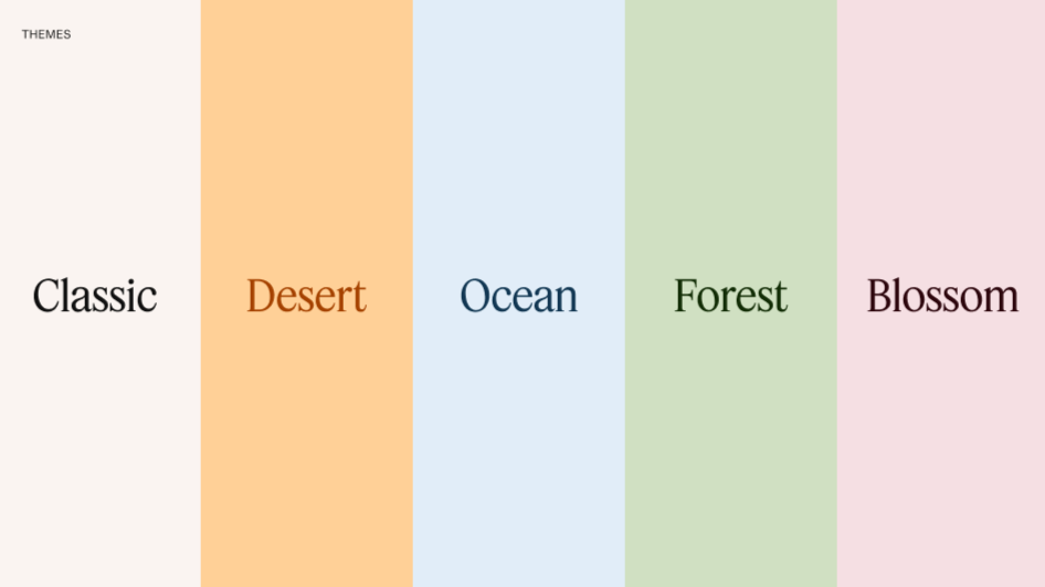
A five-theme color system. The base brand established five color themes — Classic, Desert, Ocean, Forest, and Blossom — each with its own palette ranging from a light background tone to a rich, saturated accent. My job was to make these themes work in practice: deciding which themes suited which content types, how they should be applied across post formats, and how to create visual consistency without creative monotony.
New carousel and single post formats. I developed multiple new post formats for social to give the team flexibility:
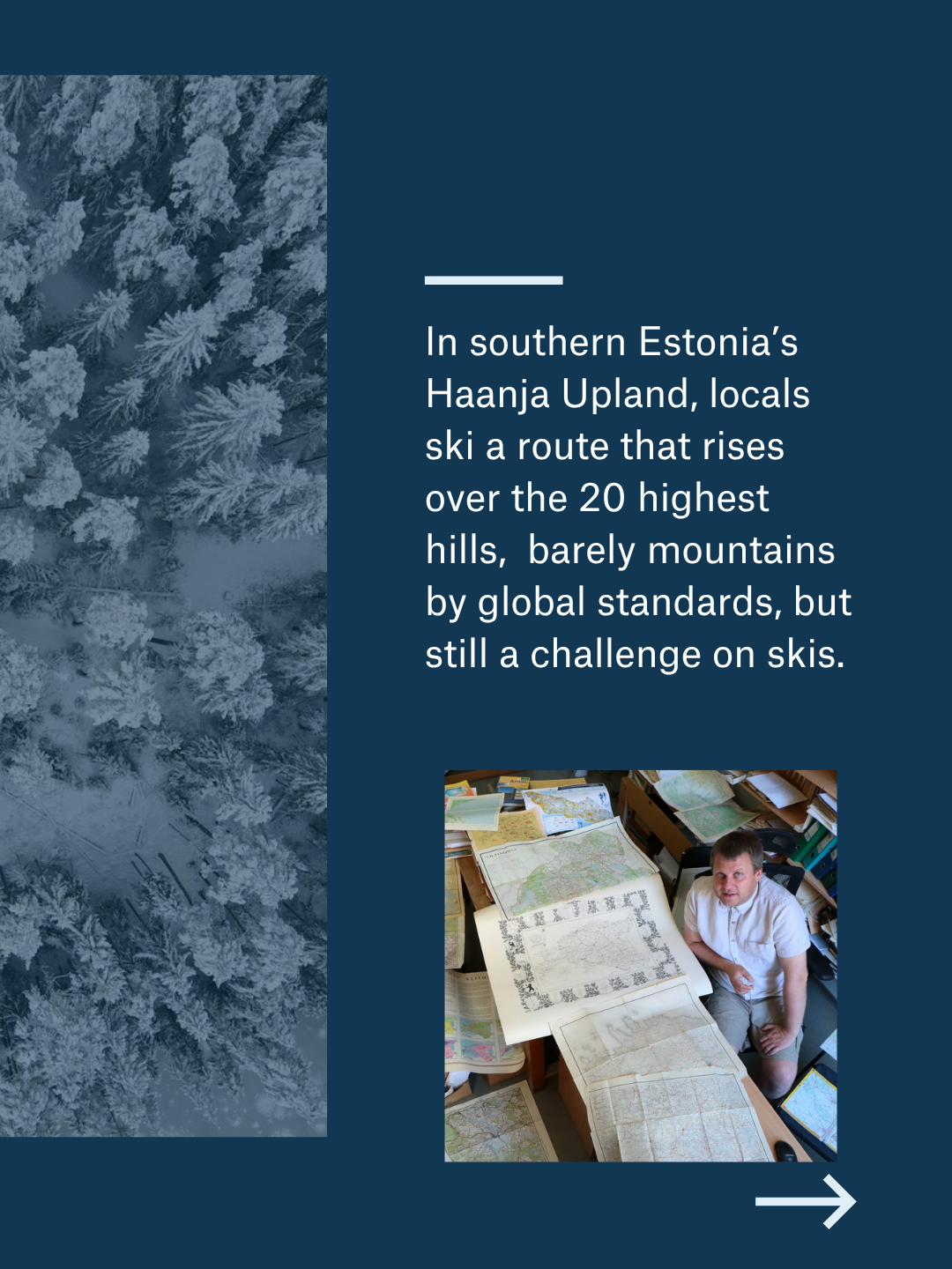
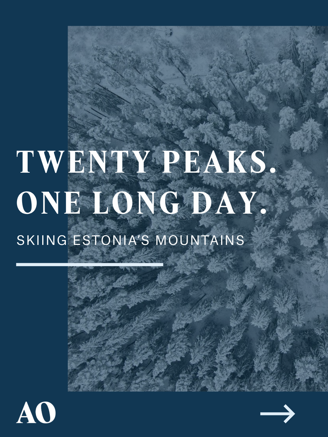
The storytelling carousels vary in approach. One is very photo forward with bold text and another uses a photo that bleeds over two slides. Each slide moves the narrative forward. The format suits long-form character profiles, hidden history, and curiosity-driven features.
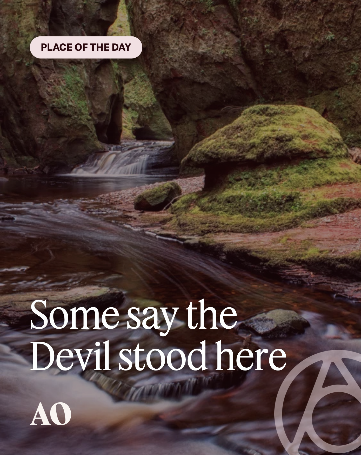
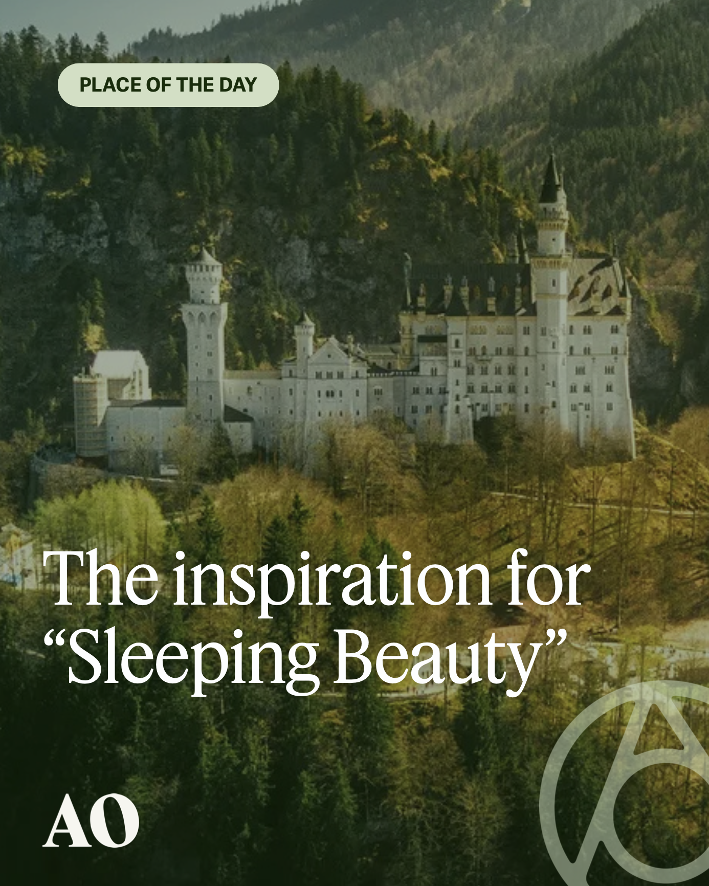
The places single post is photo forward and utilizes the color palette like a filter over the image. The color is chosen based on the image that was provided by the user who submitted the place page. It's graphic and bold, designed to stop a scroll with a strong image and a provocative headline.
Tone as much as design. The social brand isn't just a visual system, it's a voice. Headlines that ask questions. Copy that treats the reader as a fellow curious person, not a passive audience. A consistent sense that there's always something remarkable to discover, if you know where to look.
Results. During my time at Atlas Obscura, the social strategy drove a 40% increase in social referrals and a 67% increase in social engagement rate.