Building a brand that could feel rooted in Baltimore and scale across an entire state.
Brand Identity · Visual System · Regional Identity
The Baltimore Banner Brand System
The Challenge
The Baltimore Banner launched as a Baltimore-focused nonprofit newsroom. As the organization grew and expanded statewide, the brand needed to grow with it — staying locally rooted while becoming something that could meaningfully represent all of Maryland.
That's a hard design problem. Most news brands are either hyperlocal or generic. The Banner needed to be both specific and scalable.
My Role
I oversaw all visual brand direction for The Baltimore Banner, including the development of the full brand system, the regional identity framework, and the social and event branding that brought the brand to life across platforms. I also hired and managed the visuals team, including a new visuals director, photographer, and digital producer, and later hired a business designer to extend the brand across marketing, revenue, philanthropy, and human resources — expanding the brand's reach beyond the newsroom for the first time.
The Work
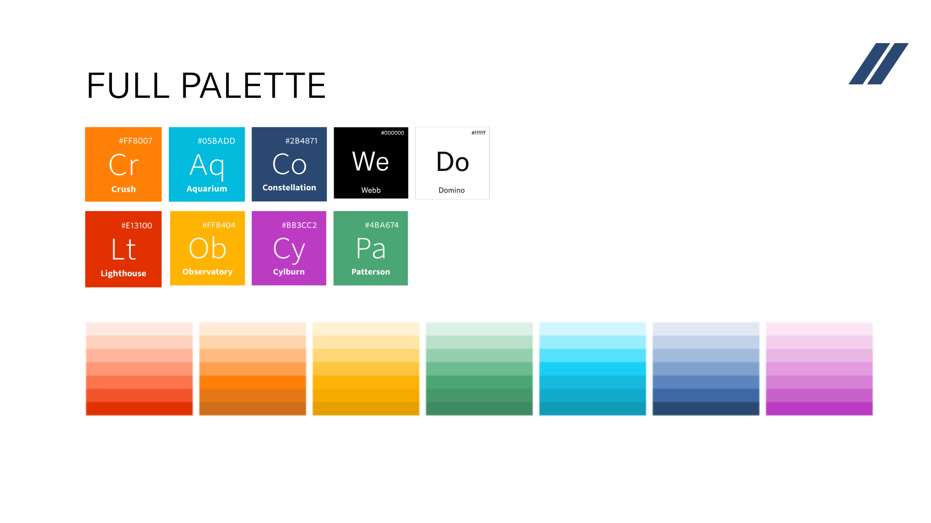
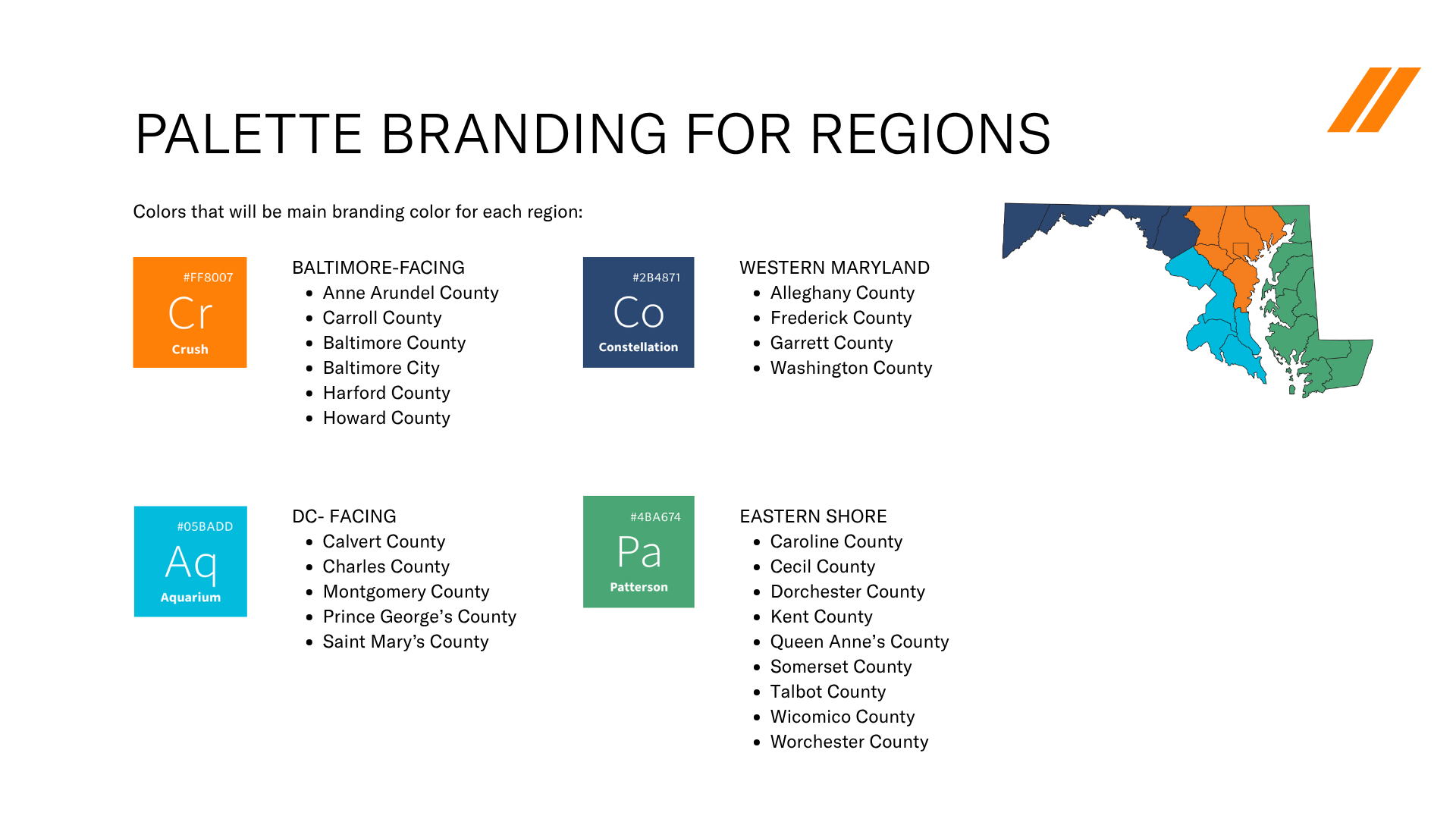
A color system built for Maryland. The Banner's primary palette, Crush (orange), Aquarium (cyan), and Constellation (navy), was designed to be bold and distinctive in a crowded media landscape. The secondary palette expanded the system with region-specific colors named after Baltimore landmarks: Lighthouse, Observatory, Cylburn, Patterson. Each color was accessibility-tested across AA and AAA standards.
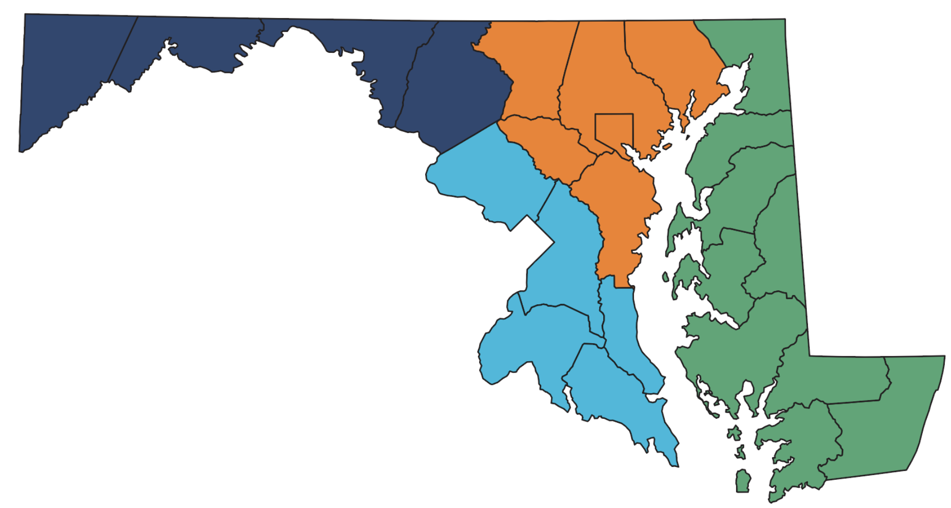
Regional identity mapped to geography. The most distinctive element of the brand system is the regional color coding, each Maryland coverage area assigned its own color from the palette. Baltimore-facing counties: Crush (orange). Western Maryland: Constellation (navy). DC-facing counties: Aquarium (cyan). Eastern Shore: Patterson (green). This gave each regional edition its own visual identity while keeping the overall Banner brand cohesive. It's a system that scales, a reporter in Howard County and a reporter on the Eastern Shore both know exactly what their brand looks like.
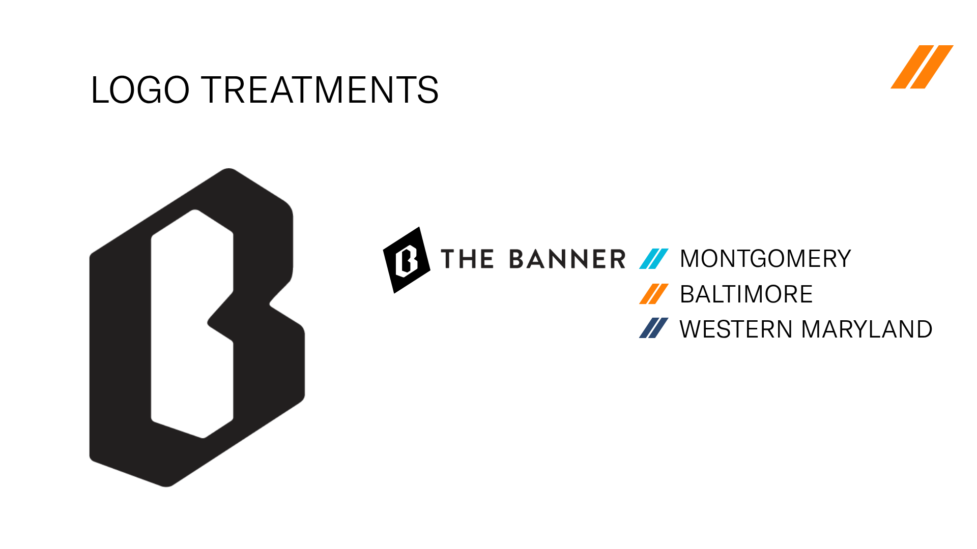
Logo treatments for regional editions. The Banner mark was extended into regional logo treatments — "The Banner // Montgomery," "The Banner // Baltimore," "The Banner // Western Maryland" — each using the region's designated diagonal color. The diagonal motif carried through the entire graphic system as a unifying visual element.
Brand voice to match. The Banner's brand voice was defined as a blend of authoritative, community-driven, and engaging — "the Wendy's of local news." Trustworthy but not stiff. Deeply relevant but not parochial. That voice informed everything from social copy to event programming to the way reporters introduced themselves at community drop-ins.
Brand extension across the full organization. One of my most significant leadership shifts was expanding brand oversight beyond the newsroom. I built out a brand system that worked for editorial, marketing, revenue, philanthropy, and HR — ensuring that The Banner presented a consistent identity at every touchpoint, from a breaking news alert to a donor reception.